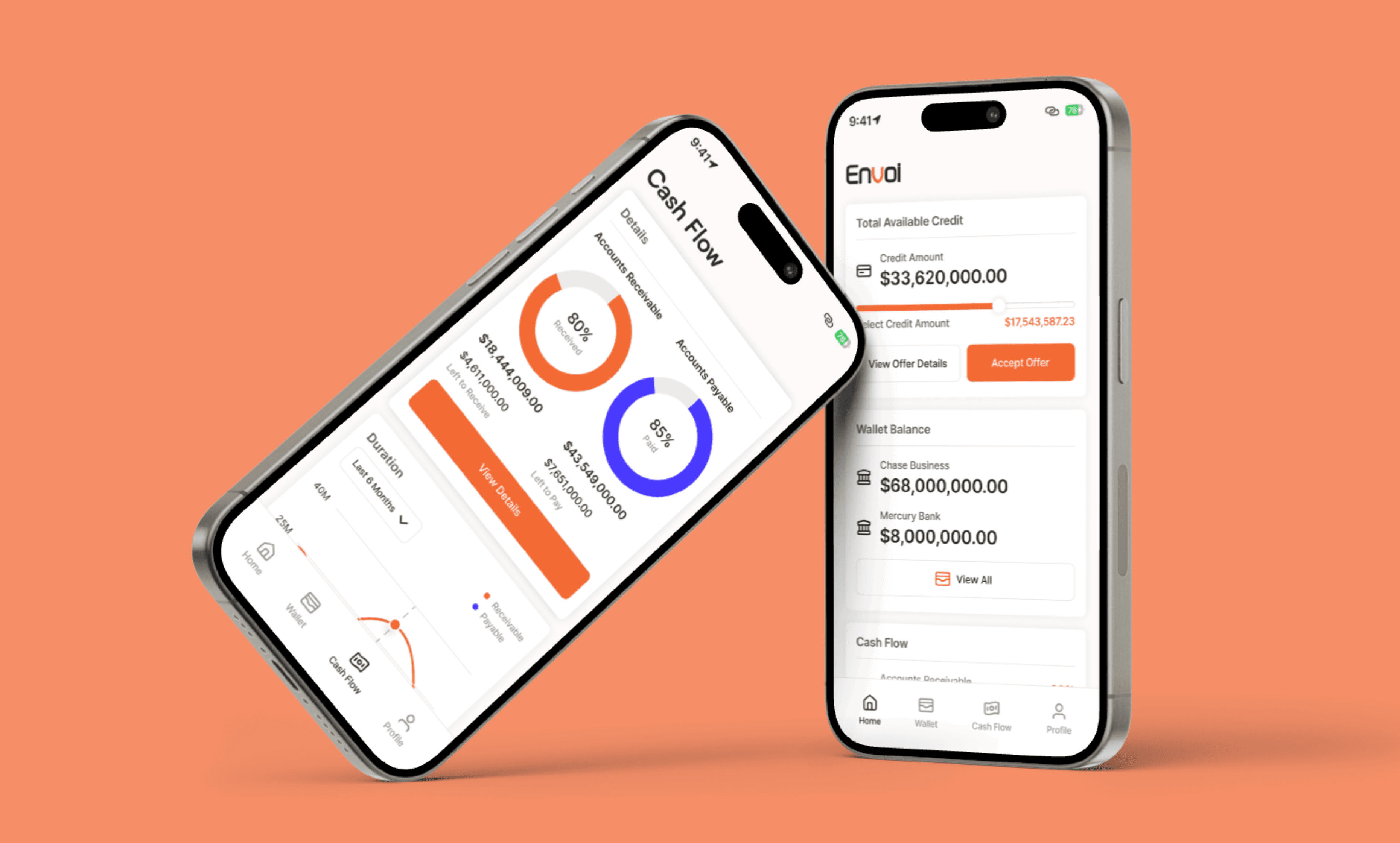
A fintech platform designed to help mid-sized businesses streamline their accounts receivable and payable management while assessing potential business risks.
Details
Timeline: Ongoing (Mobile MVP nearing completion)
Role: Founding Product Designer
Objective
The goal of this project was to design a mobile-first fintech platform that simplifies accounts receivable and payable management for mid-sized businesses. The platform helps business owners easily manage their cash flow and assess the risks associated with potential business partnerships. With a primary focus on assessing company risks, the product aims to streamline decision-making and empower business owners to mitigate financial uncertainties.
Understanding the Problem
We conducted in-depth research through interviews with small to mid-sized business owners to understand their pain points. The findings revealed that managing cash flow and evaluating potential vendors were major challenges. Business owners were spending excessive time and resources trying to manually assess risks and navigate complex financial transactions.
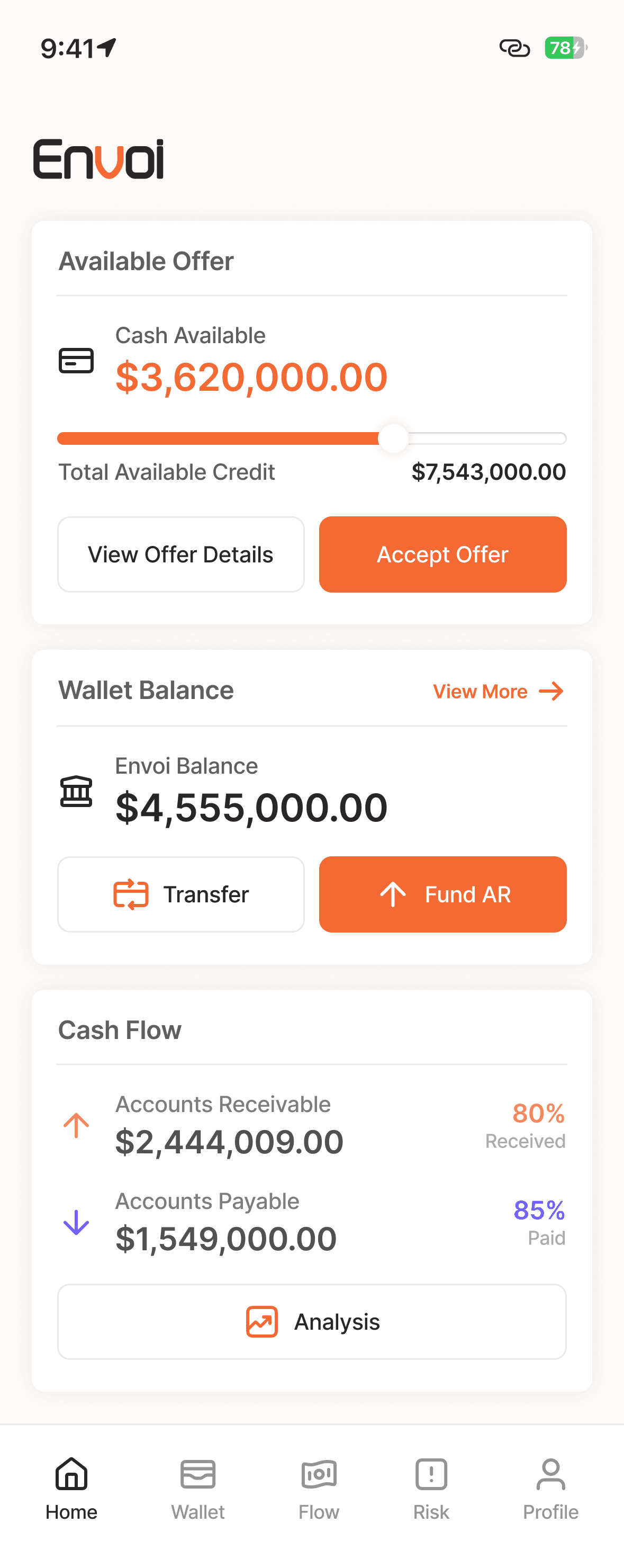
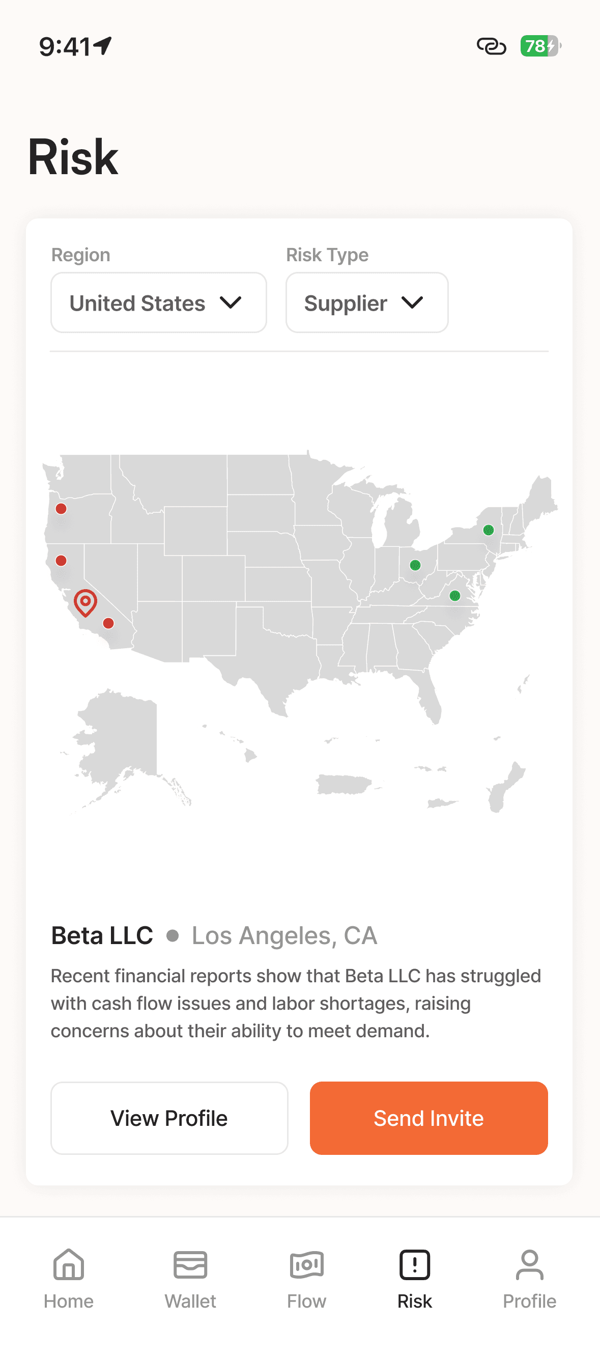
These insights informed the product's two core features: the Vendor Risk Map and Cash Flow Management Dashboard. Both of these features were designed to solve specific problems business owners face: monitoring ongoing transactions and gaining insights into a partner’s financial stability.
Key Insights:
Business owners struggled to get a real-time overview of their cash flow.
They often found it hard to assess the financial health of vendors, which posed a significant risk to their own operations.
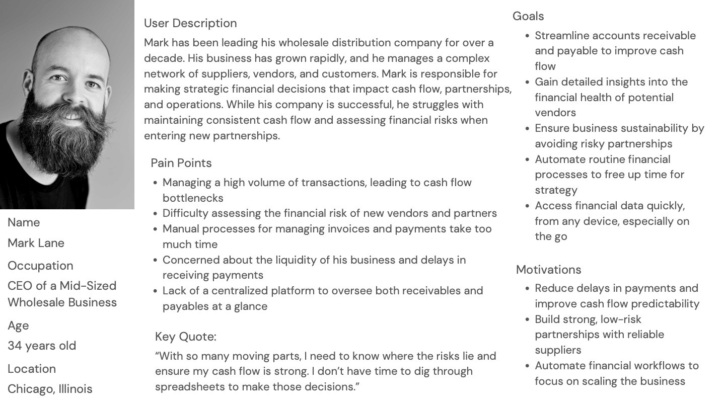
Persona
Strategic Decisions and Feature Prioritization
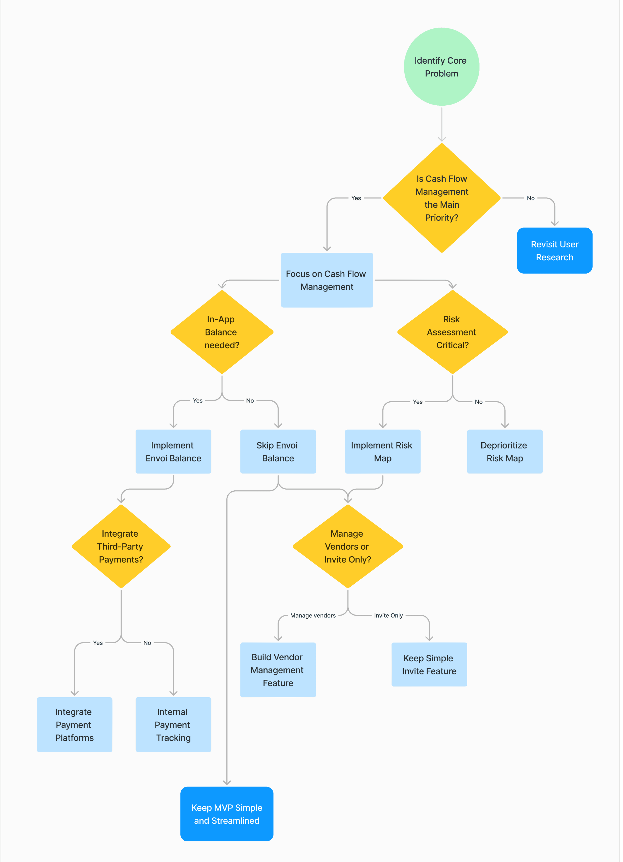
Given the insights from our user research, I had to strategically prioritize features that would deliver the highest value. Initially, there was a consideration to include more typical fintech features, such as direct payment integration. However, after analyzing competitors and consulting with the CEO, it became clear that focusing on the Vendor Risk Map and Cash Flow features would address a niche problem that was not fully served in the market.
This decision was crucial in differentiating our product from others. The priority was given to creating a visual risk map for vendors, allowing business owners to assess financial health at a glance. We postponed the integration of features like payment processing, as our users were more concerned with financial risk than with streamlining payments.
Challenges in Prioritization:
Ensuring that the product addressed a unique pain point in a competitive market.
Balancing the need for immediate value with long-term growth features.
Feature Prioritization Flow: (Refer to the attached decision tree for a visual breakdown of how the team prioritized and eliminated features.)
Decision Tree
Design Challenges and How I Overcame Them
One of the biggest challenges I faced during the design process was the initial push to integrate payment features, which could have significantly increased development time and complexity. After several discussions with the CEO and the stakeholders, I realized that the feature was out of scope for the current phase of the project.
By narrowing the focus to risk assessment and cash flow management, I was able to concentrate on designing features that solved immediate pain points for users while still allowing room for future scalability.
This experience highlighted the importance of staying user-focused and managing stakeholder expectations. I learned to communicate clearly about the trade-offs and justify design decisions based on user insights and strategic goals.
Archive Section
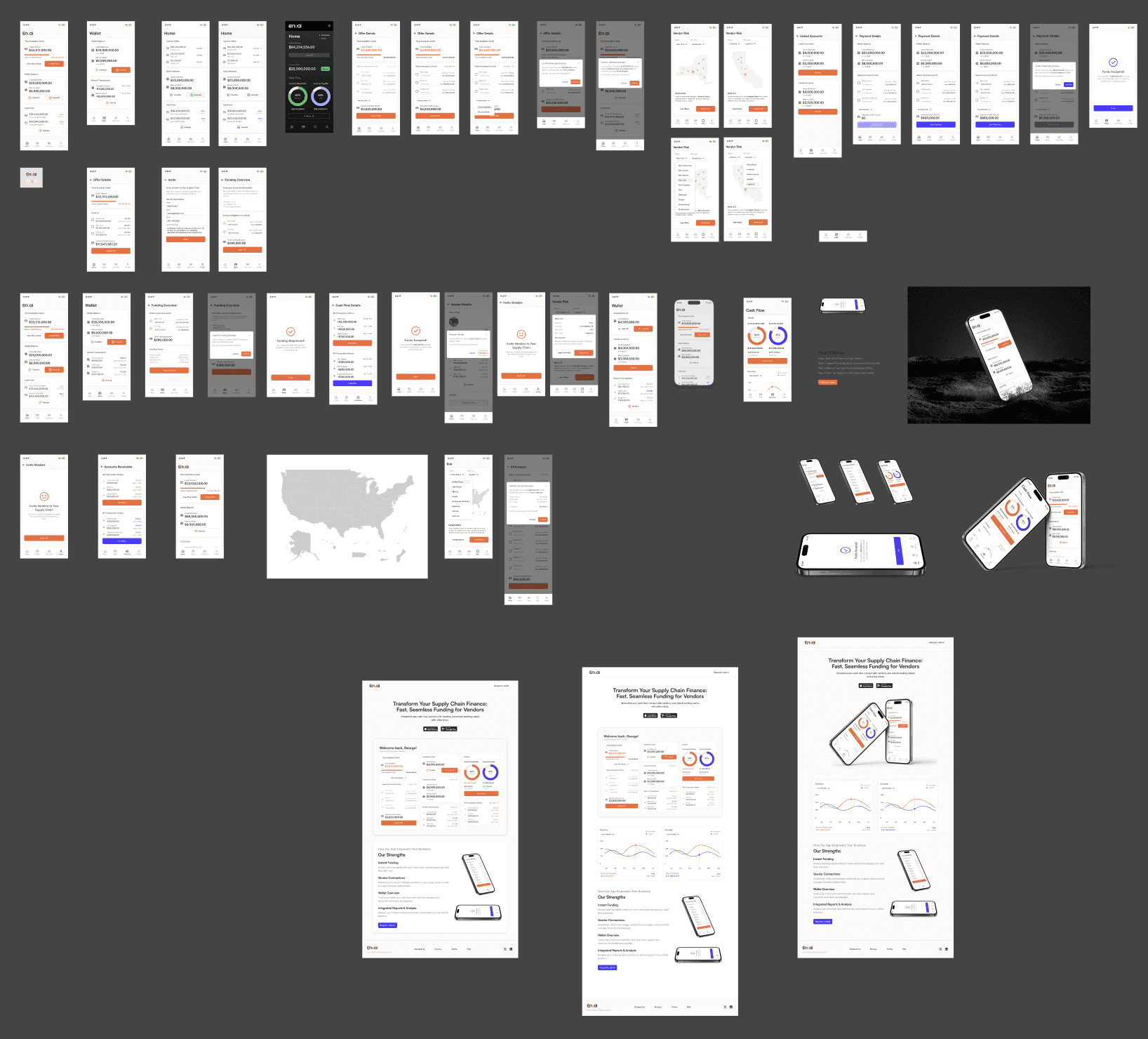
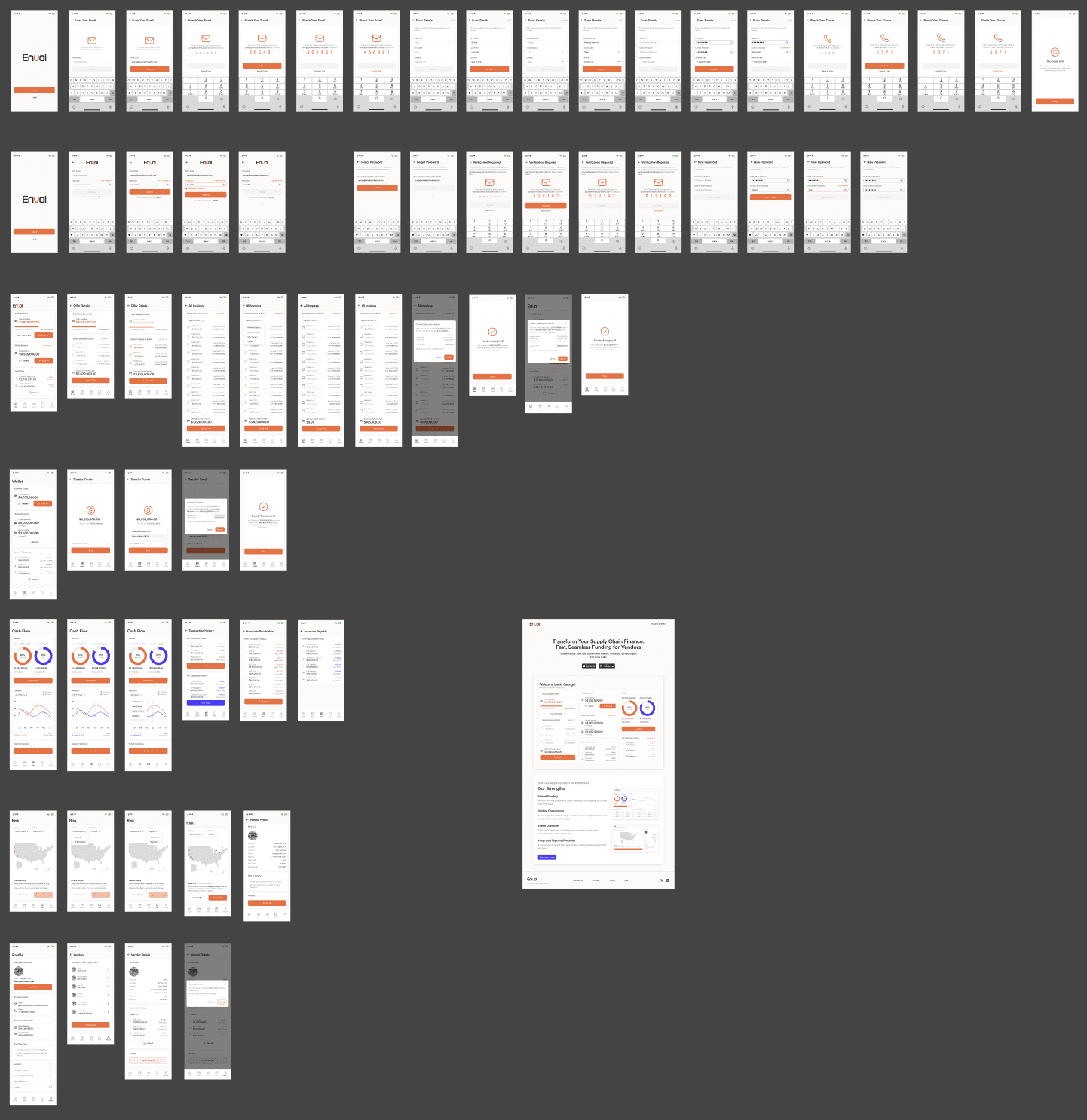
Through multiple iterations, guided by user feedback and insights from the CEO, several screens, flows, and mockups were refined or discarded during the design process. The archive section highlights these designs that, while not part of the final product, played a crucial role in shaping the overall user experience.
Early Impact and User Excitement
Despite the app not having officially launched, the early adopter feedback has been overwhelmingly positive. Users were particularly excited about the Vendor Risk Map, a feature that provides clear, visual insights into the financial stability of their partners and vendors. This excitement has resulted in a waitlist of interested businesses, eager to use the platform once it’s live.
The focus on these key features has set us apart from competitors who offer broader, less targeted fintech solutions. Early adopters appreciated the emphasis on risk mitigation and ease of use.
Mockups

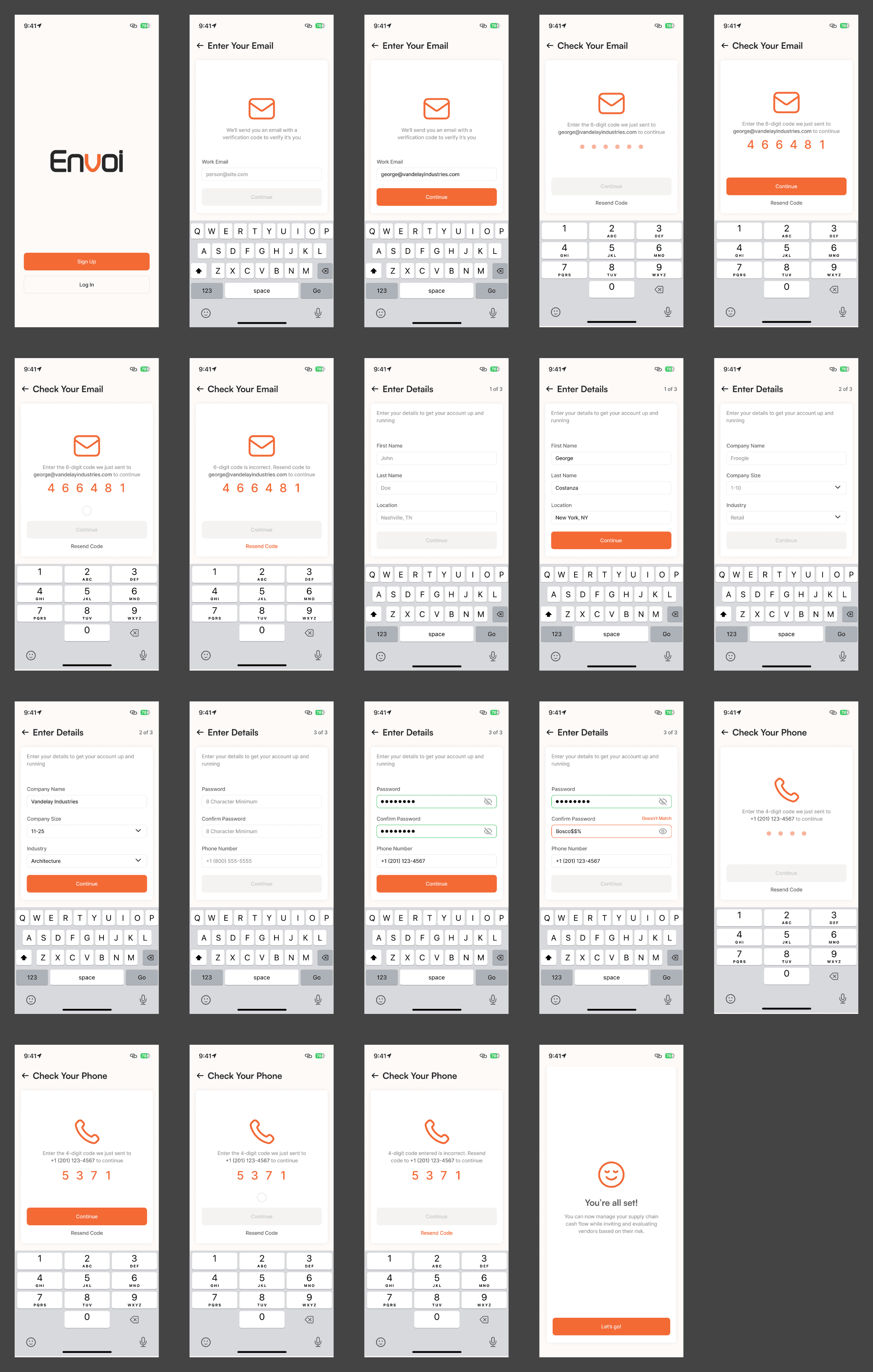
Onboarding and Security Emphasis
In a fintech platform, security is paramount. The onboarding flow was designed to guide users through account setup with a focus on building trust. We implemented multi-factor authentication (MFA) from the outset, ensuring a secure login experience.
To further enhance the user experience, the onboarding process included educational prompts that explained why certain security measures (such as MFA and strong password requirements) were essential. This helped build confidence in the product and positioned security as a core feature, not an afterthought.
Design Considerations:
Simple, intuitive onboarding that doesn’t overwhelm users but emphasizes security.
Visual prompts and cues to educate users on the importance of safeguarding their accounts.
Onboarding Flow
The Design System (Next Steps)
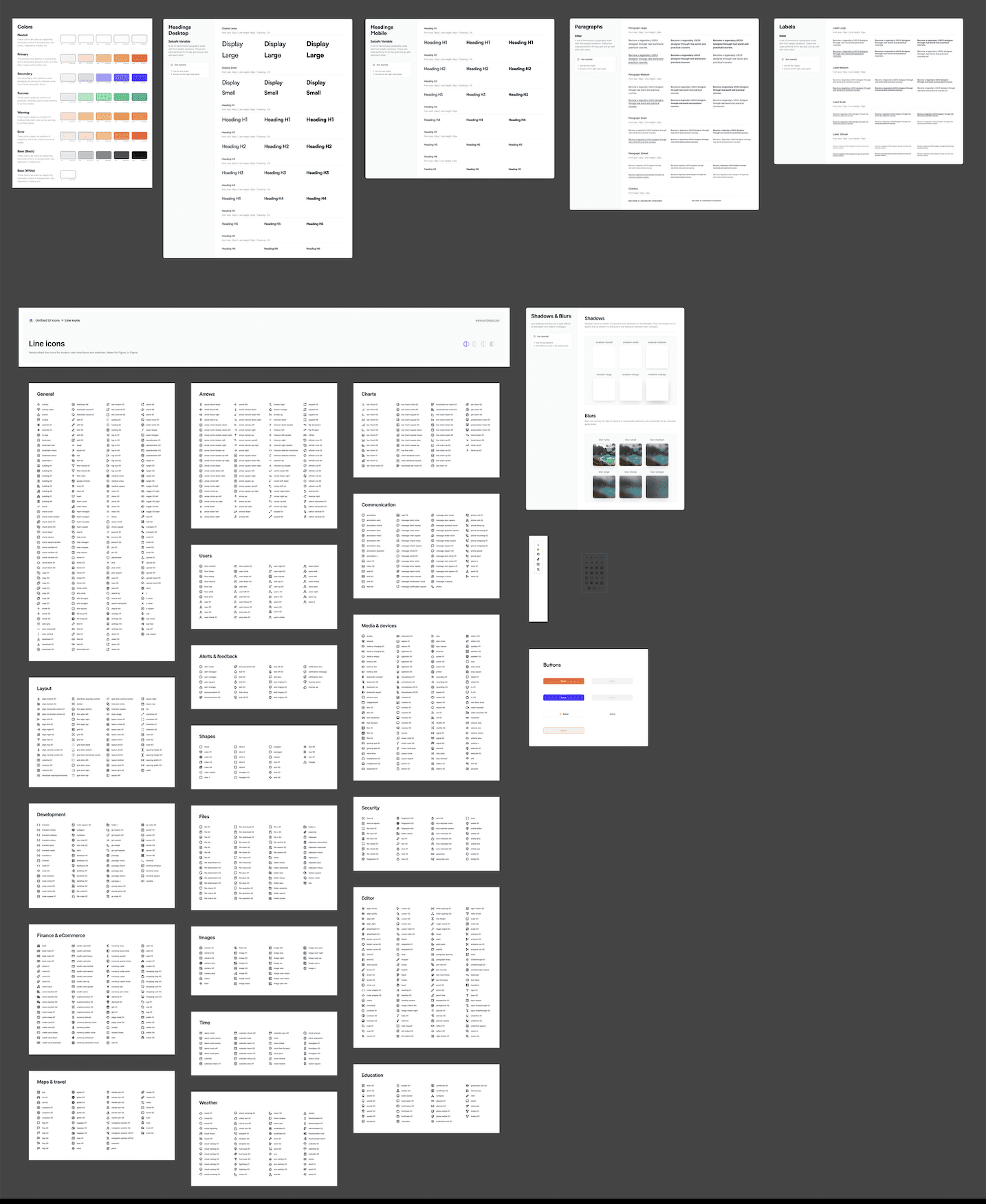
As the product moves towards launch, one of the next steps is creating a design system to ensure consistency across the mobile and upcoming desktop versions. A strong design system will not only maintain visual cohesion but also help onboard new designers or developers onto the project more seamlessly.
The design system includes:
Color Palettes
Typography
Buttons
Icons
Shadows
Blurs
Next steps will be:
Reusable Components: Form elements, and navigation items to reduce development time.
Grid System and Layout: Ensures visual consistency across different devices and screen sizes.
While the design system is currently in its initial stages, it has already proven helpful in maintaining a consistent and coherent user experience across the platform.
Design System Elements
Next Steps
As we prepare for the next phase of the project, the following steps are on the roadmap:
Scaling the design for the desktop version: Bringing the mobile experience to larger screens, ensuring it remains consistent with the core product.
Refining the design system: Further developing the design system to ensure a unified experience across mobile and desktop platforms.
Iterating based on user feedback: Continuously gathering feedback from early adopters and iterating on the product to ensure it remains aligned with user needs.
The product is now poised for future growth, with a strong foundation in place thanks to a well-considered design system and a user-centered approach.
Final Design
Reflection & Learnings
Designing Envoi has been an incredibly rewarding process filled with learning moments. I’ve gained a deeper understanding of how to balance user needs with technical constraints, and how to prioritize features that deliver the most value.
This project reinforced the importance of focus - staying true to solving a specific problem and refining features to meet user expectations without overwhelming them.
The risk evaluation tool and the Envoi balance feature emerged as game-changers during our user feedback sessions, and it’s been fulfilling to see the excitement around these features grow as we move closer to launch.
I’m looking forward to continuing this journey, especially as we expand into the desktop version and scale the product to meet the evolving needs of small businesses.
